• Design
  • Hello June Prints
  • About
  • Contact
Menu

Castano Design

  • Design
  • Hello June Prints
  • About
  • Contact

ThirdLeaf NW

ThirdLeaf NW is a fruit delivery company based in Seattle, WA whose mission is to promote healthier food options within the workplace. I managed their marketing and logo rebrand to achieve a more modern, fun, and simple design concept than what they previously had. I also helped to ensure that the new logo to more easily communicate what it is the company does.

To achieve all of this I used a geometric sans serif font with a consistent stroke throughout. I then turned part of the “d” and “i” into an apple slice. To keep the legibility intact I chose to have the piece of fruit I was abstracting to be an apple slice since the outside of the slice is a dark red that relates best to the black lettering. The inside of the slice is light enough that it does not impact legibility and become a  part of the letter. If the inside of the slice were darker you would lose the ability to easily read “ThirdLeaf”.

Another detail I made sure to include was that the apple slice was at the same angle as the angle of the straight stroke in the “e”. The slice of the leaf that creates the dot in the “i” is also at the same angle to further give this logo consistency. 

ThirdLeaf NW wanted a van wrap that was bold, and helped to easily identify  what they do at a quick glance. I created additional pieces of fruit that compliment the geometric theme and bold color palette. 

For a fun touch on the back of the van I  created a banana peel. I think this adds variety and helps give the look some fun. ThirdLeaf just landed their two biggest accounts based on people noticing the van and reaching out!

ThirdLeafPhotoSquares-01.png
ThirdLeafPhotoSquares-02.png
ThirdLeafSquares-01.png
ThirdLeafSquares-02.png
ThirdLeafPhotoSquares-03.png
ThirdLeafSquares-03.png

Crown Linen Designs

Altea Magazine Scene Creator 2.png
Altea Magazine Scene Creator 28.png
Altea Magazine Scene Creator 3.png
Altea Magazine Scene Creator 4.png
Altea Magazine Scene Creator 5.png
Altea Magazine Scene Creator 6.png
Altea Magazine Scene Creator 7.png
Altea Magazine Scene Creator 8.png
Altea Magazine Scene Creator 10.png
Altea Magazine Scene Creator 9.png
Altea Magazine Scene Creator 12.png
Altea Magazine Scene Creator 13.png
Altea Magazine Scene Creator 14.png
Altea Magazine Scene Creator 14_.png
Altea Magazine Scene Creator 15.png
Altea Magazine Scene Creator 16.png
Altea Magazine Scene Creator 18.png
Altea Magazine Scene Creator 20.png
Altea Magazine Scene Creator 22.png
Altea Magazine Scene Creator 21.png
Altea Magazine Scene Creator 20.png

Mountain View Blooms

I created a logo, submark, and additional branding for Mountain View Blooms, a floral company based in Mount Vernon, WA. The client wanted the logo to feel organic and pretty-much like the gorgeous blooms she grows. To accomplish this I pen drew a dahlia and mountain landscape that merged together to create cohesion between the two images. To give the pen drawing an organic feeling I made sure that the lines weren’t perfectly even thickness so it didn’t feel like it was created on a computer. I chose a typeface that complimented the line variation and organic feeling that the illustration had. The typeface felt like it could be found at a flower market and created by a typewriter. Since the logo was somewhat detailed I created a more simple submark that could be used in place of the logo.

MountainViewBloomsMockUp.jpg
MVBllomsMockUp2.jpg
MVBloomsFinalFinal-01.png
MVBloomsFinalFinal-02.png

Providence Hospital's Epicurean Affair

ProvMockUpPics-01.png
ProvMockUpPics-02.png
MockUpPics-01.png
MockUpPics-02.png
MockUpPics-03.png

Mobile Personal Training

Mobile Personal Training is a physical fitness program that travels to wherever the client is for the workout. Since this is the unique differentiator for this business I wanted to highlight this benefit in the new branding.

To show this unique benefit I combined a location marker with a dumbbell, with the dumbbell creating the “o” in the word “Mobile”. The dumbbell in turn creates the circle cutout for the location marker.

The owner wanted the logo to be  modern and simple, which I think I achieved with the rounded semi serif font and geometric shapes. I shortened the location marker so that “Personal Training” would not be too far down and added in the line to break up that gap.

MobileMockUp-01.png
MobileSquares-01.png
MobileSquares-02.png

Queen Anne Helpline "Taste of Queen Anne"

The Queen Anne Helpline reached out to me to assist with their upcoming annual benefit auction and dinner. 

The problem The Helpline came to me with was that the branding from years past has felt too stuffy and unrelatable. The event is not intended to be a formal event, but rather a more casual low-key gathering, keeping the focus on the cause.

I created a poster for The Hotline that combined beautiful photography of an elegantly plated bite with pen drawings to create a relatable and artisanal feeling. Since the photo I chose was of a high end dish the more playful pen drawing adds a nice juxtaposition.

I designed the auction catalogue for the evening using color to differentiate the different sections. To create cohesion with the poster I pulled in pen drawings throughout. These drawings also help to add interest and to fill in gaps within the program. I used the hand drawn underlines to further mirror the poster.

TasteSquareShadow.png
SquareTasteCatalogue-01.png
SquareTasteCatalogue-02.png
SquareTasteCatalogue-03.png
SquareTasteCatalogue-05.png
SquareTasteCatalogue-06.png
SquareTasteCatalogue-07.png

Northwest Walk for Epilepsy

I volunteered my time to create the new logo for the Northwest Walk for Epilepsy. The Northwest Walk for Epilepsy is hosted in 6 different cities between Washington, Oregon, and Idaho.

I have shown some of the options I created for the client to choose from. Ultimately we ended up going with the shoe and shoelace graphic. The client was wanting something more lighthearted and that better represented the physical walk.

EpilepsySquares-01.png
NWEplipesyMockUp2-01.png
EpilepsySquares-02.png
EpilepsySquares-03.png
EpilepsySquares-04.png
EpilepsySquares-05.png

Edmonds Realty

Edmonds Realty reached out to ask me to create an illustrated map of Edmonds and tri-fold brochure for their business. 

The intent was to create a fun, whimsical piece that would attract people to business and generate excitement surrounding the city. I believe this was achieved as I heard that people were stopping into Edmonds Realty solely to grab a map. 

My goal was to make the map fun, and playful, to capture the essence of this amazing city. 

EdmondsWeb1.png
EdmondsWeb2.png

Cecilia's Farm

I assisted in creating packaging for Cecilia’s Farm’s new product line, targeted to children, to be featured in Costco Wholesale stores. I illustrated playful drawings that help to embody the youthful nature of the product line.

CeciliasSquares-02.png
CeciliasSquares-01.png
CeciliasSquares-04.png
CeciliasSquares-05.png

The Good Ingredient Co.

I assisted in the creation of the Ocean Pop product in the Good Ingredient Co. product line to be featured in Costco Wholesale stores. In recognizing that “Prawn Cocktail” chips might not be understood immediately by consumers, I created the name “Ocean Pop” as a more appealing description of the product.

CeciliasSquares-03.png

North x Northwest

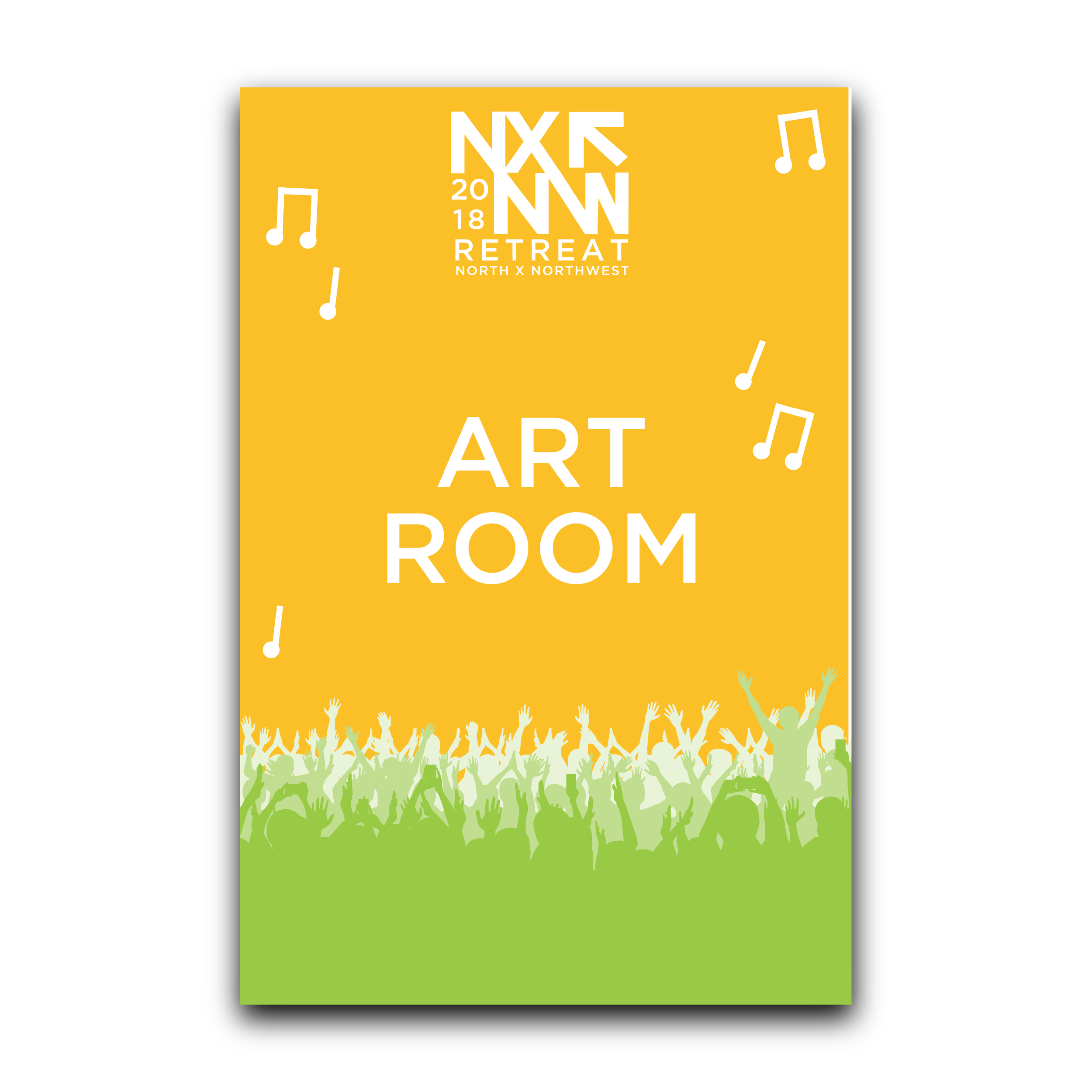
North X Northwest was a early retreat hosting around 800 employees and guests. The theme this year was a spin on South x Southwest’s music, tech, and art festival with a Northwest vibe.

I conceptualized and created the entire collateral suite for this event. My goal was to give this retreat that had such a broad theme a really tied together feeling with the design work. I pulled everything together with consistent color palette and playful imagery that I worked throughout all of the designs.

NXNWSquares-02.png
NXNWSquares-01.png
NXNWSquares-04.png
NXNWSquares-03.png
NXNWSquares-05.png
NXNWSquares-06.png
NXNWSquares-07.png
NXNWSquares-09.png
NXNWSquares-08.png
PortfolioSquares-05.png
PortfolioSquares-08.png

Soil Loves Compost

I created this concept piece to raise awareness of the importance composting plays in preserving our environment. I created the piece only with organic materials, including food I had in my fridge, soil, and compost bags. I wanted the piece to speak for itself and for the contents to communicate the message.

SoilLovesCompostMockUp6-01.png
soillovescompost.jpg
prev / next
Back to Corporate Design
6
ThirdLeaf NW
21
Crown Linen Designs
4
Mountain View Blooms
5
Providence Hospital's Epicurean Affair
3
Mobile Personal Training
7
Queen Anne Helpline "Taste of Queen Anne"
6
Northwest Walk for Epilepsy
2
Edmonds Realty
4
Cecilia's Farm
1
The Good Ingredient Co.
11
North x Northwest
2
Soil Loves Compost

360.770.0785 | katherine.dietz@outlook.com | Serving Greater Seattle Area